Skip to content
Saturday, April 20, 2024
Virtual Activism
Closing the digital divide
Registered in RI, in Consultative Status with the UN
Our mission is to strengthen marginalized communities through the use of information
communications technologies and linking them to human rights, development and the SDGs.
About us
Mission and Objectives
Board of directors
By-laws
Partners
Areas of work
Workshops & Training
Code-net Program
Tutorials & Tools
Contact us
Support our work
Membership
Why volunteer?
Our volunteers
Search for:
News
Events
Women
CSW68 – Women in Armed Conflict
Climate Change & SDGs
Undermining climate change
Climate Change & SDGs
Climate Change and Sustainability: Preserving Our Planet’s Future
AI
Emerging Technologies
It is the race to be first that will kill us
AI
News
When AI gets a nervous breakdown
Info
Reports
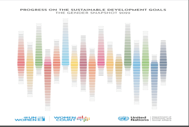
Progress on the Sustainable Development Goals: The Gender Snapshot 2022
Climate Change & SDGs
Info
Special high-level dialogue: “The Africa We Want: Reconfirming the Development of Africa as a Priority of the United Nations System”
Climate Change & SDGs
Info
Panel Discussion on Egypt’s Water and Climate Change at the High Level Political Forum on Sustainable Development – 2022
Info
Reports
IPCC report on climate change, 22
Emerging Technologies
Human rights
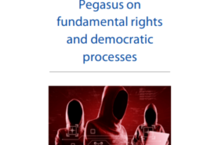
Pegasus: a Report by the Policy Department for Citizens’ Rights and Constitutional Affairs Directorate-General for Internal Policies
Events
Human rights
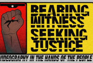
Presentation at MIT’s Media Lab, Bearing-Witness: Videography in the Hands of the People
Human rights
ICTs
VA’s statement to the 3rd session of the Ad Hoc Committee on Cybercrime
Human rights
First session of the Ad Hoc Committee to Elaborate a Comprehensive International Convention on Countering the Use of Information and Communications Technologies for Criminal Purposes
Events
CSW68 – Women in Armed Conflict
VA and the Egyptian Human Rights Forum at CSW67
CSW67 – 2023
Presentation at MIT’s Media Lab, Bearing-Witness: Videography in the Hands of the People
Emerging Technologies
It is the race to be first that will kill us
Virtual Activism’s tech trends affecting human rights, 2023
Deloitte Insights – tech trends 2023
Pegasus: a Report by the Policy Department for Citizens’ Rights and Constitutional Affairs Directorate-General for Internal Policies
Recent Tech News
CSW68 – Women in Armed Conflict
Undermining climate change
Climate Change and Sustainability: Preserving Our Planet’s Future
It is the race to be first that will kill us
When AI gets a nervous breakdown